- The central image on the film poster suggest to us that it is frighting and disoriented. This can be seen with the shadow figure appearing behind the central protagonist sleeping. With the iconography, the audience can see that this film is going to be a horror. The image also gives the target audience a hint knowing that the women who is sleeping will be a vulnerable victim in the film. The gesture code to communicate information to us is a disturbing event.
- There are 2 tag lines shown here "It's closer than you think" "All the activity has led to this". This creates anticipation for the target audience because it makes us wonder and think what the message is trying to persuade us to think. This therefore creates mystery, because you can tell that there are many explanations to what this quote means.
- The title appears underneath the central image. This has been done because to make the target audience see more of the picture rather than the film title. This is because the image takes up half of the space on the poster. The colour of the writing is in red because it symbolises the blood. The title can be seen as a faint of blurriness. The faint blurriness symbolises the genre of horror especially because things will be happening quick to create suspense and puzzle the target audience. The number '4' in the title is in a bigger font and a different colour. This makes the audience realise that this is the 4th film of Paranormal Activity. In relation to this, the number '4' can link to the colour of the background image which is filled with light blue. This could relate to the camera recording something due to the screening of the image.
- The website is at the bottom of the film poster. The website on the poster persuades the target audience who likes this type of film can go to the official site to keep updated with the information.
- The release date for the film is right at the bottom of the film poster. This produces a closer run-up to a film's release.
- The background of the poster is in black colour. This makes the picture stand out and the title of the film. Therefore, the poster is eye-catching for the audience.
Friday, 30 September 2016
Horror Conventions- Paranormal Activity 4
Below is a film poster for the horror film 'Paranormal Activity 4'.
Horror Poster Conventions- Introduction
Now that I have completed my marketing campaign for the horror genre, I am going to analyse 5 different types of horror film posters. I will be doing this because I will understand the genre conventions for later on when creating my film poster. I will be analysing the images, font, colour, layout etc.
My Marketing Campaign
I have finally chosen which genre I will be focusing on. This is the horror genre. I have been doing allot of research to see what aspects are needed in the horror genre.
Below is a link which is about horror films:
https://en.wikipedia.org/wiki/Horror_film
After gathering information about horror films, I found the following:
- Horror films often deal with viewers nightmares and fears of the unknown.
- Horror films tend to give out negative emotion to the audience who is watching the film.
- Plots in any horror films tends to have events into the everyday world.
- I Am A Legend (2007)- directed by Francis Lawrence. This made $256.39million at the box office.
- The Exorcist (1973)- directed by William Friedkin. This made $204.57million at the box office.
- World War Z (2013)- directed by Marc Forster. This made $202.35million at the box office.
Saturday, 24 September 2016
Teaser Trailer Conventions & Conclusion
After looking at 5 different teaser trailers, I found out that they all contained same conventions regardless of what the type of movie/genre it is. Below is a list of bullet points of the conventions which I found from analysing my five teaser trailers:
- Production Company
- Images from the film
- Title of the film
- Release dates
- Indication of genre- through music, voiceover, mise-en-scene.
- Website
- Cast/crew/director credits
- Music- reflects the genre but also synchronises with the images.
- A variety of camera shots/movements.
Although, analysing these five teaser trailers, I was disappointed to see that some more of the conventions didn't show up in the teaser trailers. Below are the conventions which were not seen in the teaser trailers that I analysed:
- Reference to source material of what the film is based on
- Tag lines
- Quotes that reference other films- for example 'From the director of...' or 'From the producers of...'
- References to wards that cast/crew/film may have won or been nominated for.
- Possibly references to other films or other films that have been directed/produced by the same people.
Teaser Trailer Conventions- Super 8
- Production Company- Paramount
- Images from the film
- Title of film
- Release date- June 10th
- Indication of genre- Mystery, the images are showing really bad happening but the teaser trailer does not show what it is.
- Website
- Voiceover man
- Editing- flashing images, few quick fades and dissolves
- Director credits
- Music works with genre and the images because it is a disoriented type of music.
- Sound effects
- A variety of camera shots and movement have been used.
Teaser Trailer Conventions- The Dictator
- Name of actors- Sacha Baron Cohen
-
Sound effects
- A variety of camera shots and movements
- Website
- Name of film
- Images from the film
- Music
- Reference to other films
- Eye candy- Megan Fox
- Tagline
- Indication of genre is comedy due to funny words which are said and images
Teaser Trailer Conventions-10 Cloverfield lane
- Production Company logo- Paramount
- Images from the film
- Title of film
- Release date- Coming Soon
- Indication of genre- Horror. This is because of the location and screaming. The setting is pitch dark.
- Website
- Editing- quick fades, and flashes
- Director credits
- Music- upbeat reflecting the fast moving images and the genre of the film.
- Sound effects
- A variety of camera shots and movement.
Teaser Trailer Conventions- Teenage Mutant Ninja Turtles: Out of the Shadows
- Production Company logo- Paramount Pictures
- Images from the film
- Title of the film
- Release date- June 3rd
- Indication of genre- action
- Voiceover man is vaguely at the end
- Editing such as quick fades
- Cast, crew, director
- Images of stars and name of stars
- Many sound effects used
- Eye candy- technology and Megan Fox
- Variety of camera shots and movement
Teaser Trailer Conventions- Secret Life Of Pets
- Production Company logo- Universal
- Images from the film
- Title of the film
- Release date- July
- Indication of genre- Animation/Comedy due to the images being cartoon
- Website
- Voiceover man
- Music lively, different style of music like rock- which relates to the type of music the dog likes. This reflects the genre of the film.
- Reference to other films which have been produced by the same people such as Despicable Me.
- Reference to tagline
- A variety of camera shot
Teaser Trailer Conventions Introduction
I have already compared teaser trailers with theatrical trailers, pointing out the similarities and differences between them. I am going to be looking at 5 different teaser trailers from different genres to see if the conventions of the trailers are the same regardless of the genre of the film. The 5 different genres of films I will be looking at are animation, action, horror, comedy and mystery.
Comparing Teaser and Theatrical Trailers 2
Here are both the teaser trailer and theatrical trailers of the film 'Tomorrowland':
Teaser Trailer:
Theatrical Trailer:
- Again, the theatrical trailer is roughly two minutes long whereas the teaser trailer is just over 30 seconds.
- They both have the movie title
- Both trailers have the production company logo
- Teaser trailer editing is faster than the theatrical trailer.
Comparing Teaser and Theatrical Trailers 1
Here are both the teaser trailer and theatrical trailers of the film 'Fast and Furious 6':
Teaser Trailer:
Teaser Trailer:
Theatrical Trailer:
- The theatrical trailer is roughly three minutes long, whereas the teaser trailer is just over 30 seconds.
- Normally, teaser trailers has the production company logo in the beginning. However, normally in official trailers they show the production logo few seconds into the trailer. This can be seen in both trailers.
- There is more detailed information and narrative of the film in the theatrical trailer. This means that the audience knows what the movie is about and with the characters inside the trailer. However, in the teaser trailer, it doesn't give us much information of the film and therefore, the audience does not have an understanding of the story.
- Both of the trailers end with the name of the film and the release date.
- The editing is quicker in the teaser trailer, compared to the theatrical trailer it is slower.
- Both trailers have the name of the film.
- The teaser trailer gives us the 'eye candy' bits of the movie.
Comparing Teaser and Theatrical Trailers Introduction
I am going to compare two teaser trailers and two theatrical trailers from two different films. They are 'Fast and Furious 6' and 'Tomorrowland'. 'Fast and Furious 6' is an action/thriller movie and 'Tomorrowland' is an fantasy/mystery movie. I will be looking at the similarities and differences between the trailers. This hopefully will give me an understanding of what to expect when I create my own teaser trailer.
Tuesday, 20 September 2016
Fangoria Front Cover Analysis
This is a front cover from the magazine called ‘Fangoria’. This is an USA film fan magazine which specialises in the genre horror. This is mainly for teenagers and adults who like this sort of magazine. This magazine only focuses on recent films which have the horror genre. This can be seen for example “Insidious”. This horror film came out in 2010. The masthead is in big bold font with the letter ‘F’ and letter ‘A’ which is pulling down. This symbolises to us that the main title is sharp, making us feel scared because in some of the letters there is a colour red which represent blood, and you mainly find that in horror films. The dominant central image represents and is the key part in making this magazine specialised in horror due to the facial expression on the characters face and with the black background which only makes us focus on whats around the magazine. At the bottom of the magazine it has other images which represents that the type of films are in the horror genre and which will appear in the magazine.
Entertainment Weekly Front Cover Analysis
This is a cover from Entertainment Weekly, an American magazine. This magazine focuses on films and music rather than just Hollywood Films. The masthead is in a big bold blue colour text, symbolises that the magazine is not just for females even with a dominant central image is an actress but can be for males. The fonts here are in different colours which makes the magazine look attractive and not just plain. The dominant central image is of an A-List Star Emma Watson and this image relates to the magazine cover because next to the image, there is a bold font saying ‘Harry Potter’. This suggests that the image is telling us that she plays a big part in the film. This magazine also contains cover lines not jus of films but of music which is not shown in none of Empire or Total Film magazines. Therefore, this magazine is more different in terms of the context it has inside the magazine.
![](https://blogger.googleusercontent.com/img/b/R29vZ2xl/AVvXsEjp1xvFWjD73Uc41JUUL2WNcq0oCHQt9o_ncBBn-ywzztT_D-taX8SFx2DI_GalumDtpuuWKpMgdOOQs-XlAWpp3Aoiawov7vZYnSrWeIdtKKOi57S_xd5rmsLYelZnG2160LfnLyiveVcz/s320/entertainment-weekly-3.jpg)
Sight & Sound Front Cover Analysis
This is a cover from Sight and Sound, an independent British film magazine, which focuses on independent, British and World cinema rather than mainstream Hollywood movies like the Empire and Total Film magazines. The masthead is plain and the font is in bold black and red colour, suggesting that the magazine may focus on lower budget films rather than big Hollywood blockbusters. The fonts used are more expressive rather than blocky. This might suggest to us that it is representing the nature of magazine. This is also done by the rectangle yellow box, which represents that it’s a bright colour. Therefore, the magazine stands out for the target audience who like that type of magazine and to make them buy it. The dominant image is of a movie director, which lots of people would not recognise because normally in top magazines like Empire, it has people we know who has been in films lately and most people only know the names and faces of the actors of the film. Furthermore, the films he directs are most probably aimed at a type of audience who likes the directors instead of the actors who plays in the films.
Total Film Front Cover Analysis
This is a cover from Total Film. The magazine offers different types of films such as ‘The Hobbit 2’, offers cover lines and other images at the top of magazine. It predominantly features Hollywood movies. The cover image is often of a globally recognisable a-list star. The masthead on this cover is the biggest and boldest font on the page. It is thick white and sharp font, reflecting that this magazine features high Hollywood films which many people watch. Although the dominant image shows two people, it symbolises to us that superman - Clark Kent played by (Henry Cavill), will protect the innocent people and represents as a God like hero. The bright shiny silver words stand out against the dark grey background which shows us no one can harm superman and also represents that these well known films would stand out against independent films.
Empire Magazine Front Cover Analysis
This is a front cover from an ‘Empire magazine’. This type of magazine is a British film magazine published monthly. This is the best selling film magazine in Britain and focuses on mainstream Hollywood blockbusters. You can see this immediately on the front cover as the known movie character Katniss Everdeen from the Blockbuster “The Hunger Games” and actor Jennifer Lawrence as the dominant image on the cover. In addition the cover lines talk about films such "Tomorrowland" which is a block buster film. The font chosen for the masthead of the cover also represents the type of magazine it is. The powerful red used to represent bold writing embodies the dynamic well known films advertised on this cover.
Monday, 19 September 2016
Different Film Publication - Magazine Front Cover Analysis Introduction
Now that I have looked at all the existing film publications, I'm going to look at 5 different covers from different types of publications and analyse them in terms of layout, style and content. I have not yet made my decision of the genre or type of film I want to create. However, this should show me that when I am creating my film magazine front cover, I would need to reflect the type of film through the type of magazine I use, and through the layout, style and content of the front cover.
Magazine Cover Conventions
Below are all possible magazine film conventions that can be found on magazines. I found many of these when analysing existing magazine covers and I will use them when creating my own magazine cover.
Masthead:
Other Images:
Banners:
Barcode:
Slogan:
Cover lines:
Main Cover line:
Dominant Central Image:
Web address:
Price and Date:
Issue Number:
Masthead:
Other Images:
Banners:
Barcode:
Slogan:
Cover lines:
Main Cover line:
Dominant Central Image:
Web address:
Price and Date:
Issue Number:
Magazine Cover Analysis - Conclusion
Now that I have completed this task, I discovered that conventions of magazine covers are the same where it doesn't matter if the magazine of the cover changes on the audience and publication type. This can be seen for example when comparing the cover lines of Empire and Uncut, because the films which I analysed were for completely different audiences. When I decide which type of publication I am going to create, I now have a better understanding of what type of magazine conventions to use. I also need to think carefully about the type of font and colour to use because it reflects the type of magazine it is and therefore what types of films need to feature on them.
![](https://blogger.googleusercontent.com/img/b/R29vZ2xl/AVvXsEiVyyXJoFXjbMrlRTw5p5ExuogT-92KSBRWigONpPxGUB9dS61XUckl1f1GpXFYT9nY1mjoetVjNKfp5-I9vZzZ1-b35of4oCsbZMn7TnI0eHYDxkIsu5thAP5057FI-uaPvVz5_Fjl6YQI/s320/Uncut.jpg)
Magazine Cover Analysis 2
This is my next magazine cover which I am going to analyse. This is a 'Uncut' magazine.
This type of magazine has the conventions of Banner, Masthead, Dominant central image, Issue number and barcode, Web-address, Cover line and a Slogan.
Magazine Cover Analysis 1
This is the first magazine which I will be analysing. This is a 'Empire' magazine.
This magazine cover has the following conventions: Slogan, Dominant Central Image, Masthead, Banner, Main Cover Line and Cover Lines.
Magazine Cover Analysis Introduction
Now that i've understand the content of the different type of magazines there are, I'm going to do the same for film magazine covers. I am going to be looking at two different film magazine front covers from different publications that are aimed at different audiences.
Existing Film Publications
1) American Cinematographer: This magazine cover is published monthly by the American Society of Cinematographers. It focuses on the art and craft of cinematography, covering domestic and foreign feature productions, television productions, short films, music videos and commercials. The emphasis is on interviews with cinematographers, but directors and other filmmakers are often featured as well.
2) Hotdog: This was a film magazine first published in the United Kingdom in 2000. it tended toward a cynical view of the film industry (especially Hollywood). It usually avoided jumping on the blockbuster bandwagon and frequently published pieces which appeared to be contrary to widespread opinion.
3) Little White Lies: Little White Lies is an internationally distributed movie magazine. Its content is split into three parts such as the lead review, a series of feature articles inspired by the cover film, and the reviews section, which also includes interviews with directors and stars of upcoming movies.
4) Screen International: Screen International is a film magazine covering the international film business. The magazine is mainly aimed at those involved in the global film business. It also produces daily publications at film festivals.
5) Fangoria: Fangoria is an internationally distributed US film fan magazine specialising in the genres of horror, slasher, splatter, and exploitation films. It mostly targets teenage audiences.
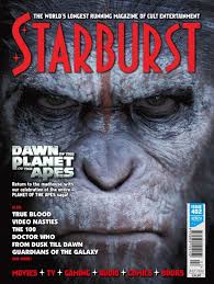
6) Starburst: Starburst is a British science fiction magazine published by Starburst Publishing Limited. The magazine is published monthly. This magazine contains news, interviews, features and reviews of genre material in various media including TV, film, soundtracks, multimedia, comics and books.
7) SFX: SFX means Special Effects. This is a British magazine covering the topics of science fiction and fantasy. It is published every four weeks by Future plc and was founded in 1995. The magazine covers topics in the genres of popular science fiction, fantasy and horror, within the media of films, television, video games, comics and literature.
8) Shivers: Shivers was a UK based magazine that began publication in 1992. It was dedicated to horror movies, television shows and literature.
9) Uncut: Uncut is a monthly magazine aimed at 25 to 45 year old men. Its publication is based in London. It is available across the English-speaking world, and focuses on music, but also includes film and books sections.
10) Film Threat: Film Threat is a former print magazine and, now a online site which focuses primarily on independent film, although it also reviews DVDs of mainstream films and Hollywood movies in theatres.
11) IF (Magazine): This was an American science fiction magazine launched in March 1952. The magazine was moderately successful, though it was never considered to be in the first tier of science fiction magazines. Later it was merged into Galaxy Science Fiction.
12) MOVIESCOPE: MOVIESCOPE is a multi-channel media outlet launched in 2006 to help the film industry market their facilities, services and content at major industry events.
13) Entertainment Weekly: Entertainment Weekly is an American magazine, published by Time Inc, that covers film, television, music, Broadway theatre, books and popular culture. It mainly concentrates on entertainment media news and critical reviews. This type of magazine targets a more general audience.
14) Filmmaker: Filmmaker is a publication magazine covering issues relating to independent film. The magazine used to be available outside the USA, but has not been on sale in the UK since early 2009.
15) TotalFilm: TotalFilm is a UK-based film magazine published 13 times a year. The magazine was launched in 1997 and offers cinema, DVD and Blu-ray news, reviews and features.
16) Empire: Empire is a British film magazine published monthly. It is the biggest selling film magazine in the United Kingdom and is also published in the United States. Empire organises the annual Empire Awards which were sponsored by Sony Ericsson. The awards are voted for by readers of the magazine.
17) Hollywood Reporter: The Hollywood Reporter is a multi-platform American media brand, focusing on the Hollywood motion picture industry, television and entertainment. The weekly print edition of The Hollywood Reporter includes profiles, original photography and interviews with entertainment figures. It also has articles about major upcoming releases and film reviews.
18) Sight and Sound: This was first published in 1932 and it gets published monthly.The magazine reviews all film releases including those with limited release and as well features a full cast and crew list for each reviewed film.
19) Cinefex: This is a professional movie special effects magazine. It is among the first dedicated special effects magazines ever produced. Within its pages can be found detailed articles about the special effects (both physical and CGI) of a certain upcoming movie, composed mainly of various interviews with the people involved.
20) Film Comment: Film Comment is an arts and culture magazine. It features reviews and analysis of art-house filmmaking from around the world.
Subscribe to:
Posts (Atom)