Monday, 8 May 2017

In what ways does your media product use, develop or challenge forms and conventions of real media products?- Teaser Trailer

For the main part of my coursework, I needed to make a teaser trailer to advertise my potential film. In order to create my teaser trailer, I had to plan, film and edit my teaser trailer. What I did was that I researched into the conventions. I did this to get an understanding on what I should put in my own trailer.


To begin with, I looked at the similarities and differences between theatrical and teaser trailers as I thought it would understand what I should put in a teaser and trailer and what to leave out. I looked at two films that had both a teaser and theatrical trailer. Here are the links below:


After doing this, I learnt that teasers trailers are shorter than theatrical trailers and that I cannot reveal too much information in it. I then wanted to focus on teaser trailers and look into their conventions so that I know what I need to include in mine to make it look realistic. I analysed 5 different teaser trailers advertising films from different genres. 


 I found that all teaser trailers have the same conventions regardless of their genre. Some of the conventions include images from the film, tagline, music, a variety of shots and camera angles, sound effects etc. Below is a full list of the conventions that I found:


Sunday, 7 May 2017

In what ways does your media product use, develop or challenge forms and conventions of real media products?- Magazine

For my next practical coursework, I  had to create a magazine front cover that advertised my film. Before I was able to do this I had to do research into the conventions of magazines to see what was appropriate to put on my cover, and what would make it look thought provoking.


When researching the conventions of magazine front covers, I looked at two different kinds of magazines - a mainstream magazine, and an independent magazine.


I did this to see if they shared the same conventions regardless of their target audience. I concluded that all magazine front covers did share the same general conventions such as a masthead that usually appears at the top of the magazine, and cover lines that make references to what will be inside the magazine, but what is done with those conventions usually depends on what style of magazine it is.


Therefore, this research showed me that I need to include these conventions on my magazine cover to make my cover look achievable.

I then looked into the styles of magazines to see which would be the most appropriate for my film to be advertised on. 

I then chose that it was most appropriate for my film to be advertised on a independent magazine like Fangoria or Scream, as I wanted my horror/mystery genre to be a low independent film. Once I had decided this, I needed to look into the conventions of independent magazines in terms of font, layout, colour etc.


All this research into the conventions of magazines  and the conventions, it helped me put together my magazine front cover.

In what ways does your media product use, develop or challenge forms and conventions of real media products?- Poster


For my next task I had to create my poster. To begin the research for my poster I looked at a variety of existing posters from different genres to get a sense of the conventions.


From analysing these posters,  I found that all posters share the same conventions regardless of the genre. For example they may have a tagline, billing, a dominant central image, certificate and so on. Once I had decided to focus on a horror/mystery genre, I decided to look into the genre conventions so that I knew what to include on my poster. I looked at them in terms of font, colour layout and many more.


After this, I decided that background colour of my poster should be black and plain like the majority of horror posters I looked at. I wanted the colour of the font to either be a red to represent blood. From my research I knew that the serial killer should be on the poster.

Once I created made my billing, decided the name of my film, and the release date, I started playing around with colours and layout with the influence of the other posters that looked at in the same genre. 


My poster contains the film's central antagonist, as was common in the genre posters I had analysed, whilst also making reference to other films from the genre. I also made reference to horror in the tagline and incorporated a bold white text.


How effective is the combination of your main product and ancillary tasks?

The marketing campaign is essential to keep a sense of continuity across all of the media products that are being used to promote the film. This is done because the audience will realise that each text is advertising the same film. A unified campaign helps establish an awareness of the film, showing the potential audience of constant images associated with the film, so that when they make a choice about what to see at the cinema, the film will be fresh in the audience's minds.


All around my campaign I tried to make sure that there were many similar elements. The font used on my teaser trailer and poster, for example, are the same colour but not the same font, making them sort of similar but with the teaser trailer title  fading out. This means that when the audience are watching the teaser trailer and looking at the poster they can see that they belong to the same film. 

For the magazine cover, I did not use this font as it needed a completely different font, which is different from the film. This is because magazines have their own unique style, that is consistent from their magazine issue to issue - whilst the film companies may be able to influence which image appears on the front cover of a magazine, it is unlikely that they will persuade the magazine publishers to change the font that they use on their front cover.

(image of magazine title)

I also used similar tagline's in my teaser trailer and on my poster which relate to the kind of genre my film is. By having the similar tagline's on the teaser trailer and poster it becomes easy for the audience to associate what the trailer is about while linking it ot the tagline on my poster. The tagline doesn’t give away any extensive detail about the plot, but the small hint may make the audience curious and build anticipation. There is no tagline for the magazine cover, however if there was it would not be the same as the film, it would be something that relates to the magazine emphasising that it is independent from the film.

Tagline from poster:  


Taglines from teaser trailer:


However, the main central image used in the poster is not the same as the image I used on the magazine cover, they are both completely different as the magazine cover shows the serial killer and the poster just shows the red hand with a knife. You can tell by this that they are associated with the killer.


I used the same credits/billing on my poster and my teaser trailer. I did not include billing in my magazine as it is not a convention of magazines. Instead, they include cover lines related to features or reviews of forthcoming films. The same goes for production company logos which are featured on my trailer and poster but would not appear on the magazine cover.


The date of release is not the same on my poster and teaser trailer. The magazine’s date is October 13th, tying in with the poster. This will, notify the audience on when the film will be released. 


Wednesday, 3 May 2017

What have you learned from your audience feedback?

During my research and planning activity, I tended to seek information from my target audience through questionnaires, and making changes to my decisions based on their feedback. I did this so I would know what to put for my media products to make it presentable.

Results for my teaser trailer questionnaire


What I learnt from my audience feedback from my magazine front cover was that they felt the colour scheme I used was dark and spooky due to the background from my magazine, but also keeping with the layout and context within the magazine. They felt the big bold font used for the masthead and cover lines were very appropriate for my horror cover, and that the cover lines themselves featuring other horror/thriller films and actors again conveyed the kind of magazine it was. The majority of the audience did think my magazine cover looked representable, however some said they would have liked to see some other spooky images on the cover and by having a dark scenery in the background.


The audience feedback for my poster was that they picked up on was the font and its colour.  They felt that it was an indication of the genre, and that from the black and red writing and background, it could immediately tell that the poster was for a independent low budget horror/mystery film. Moreover, they felt the red hand and knife was indicating that there would be killing which made the genre of the poster more obvious. Therefore, the majority did say they felt my poster looked interesting especially when seeing the poster from a long view. However, some felt it was too much red and bit boring from looking at it.


The feedback I got from my teaser trailer  was that the trailer gave a bit of the narrative away but withheld a lot of information as teaser trailers do. The opinion on the music was that it effectively displayed the genre and the white bold text used on certain words of the writing was effective. They said that the images and sound flowed well even with the fading out and fading in effect. Also, how the title came in by becoming small then shoot to big really quick. In comparison to this, they also mentioned that the narrative fitted the genre f my film and included a variety of shots, mise-en-scene, sound and editing. However, they said that one shot could of been redone at the beginning when the image was the trees where the camera shook a bit. Also, how the victim almost getting killed by killer should of said her voice more frightening.


How did you use media technologies in the construction and research, planning and evaluation stages?

Overall, throughout my whole blog, I have used a range of technologies that have been really important and useful, in helping me to put a lot of thought, ideas and detail, in all my research and planning and my evaluation. I have used a range of software and hardware throughout all elements of my A2 coursework, such as Blogger, Soundcloud Youtube.


  • By using Blogger, it is just like Microsoft Word Document but with extra tools which you would not expect. This software, has meant that I can organise and manage tasks, include images, video clips, sound files and links. These were easy to upload and really enhance the look of the blog for the reader. This has also given my content structure to follow with different posts which makes my blog look neat, even with changing the background.


  • Next to record my film teaser trailer, I used a digital video camera which was a 'Panasonic HDC TM900'. By using this equipment, it was easy to film because I could take a variety number of shots and it was easy to erase the shots I was not happy with and play them back. 


  • I was able to upload my shots onto the computer. By doing this, I was able to arrange the shots in separate folders, giving me more time to edit the footage.


  • When I was in the middle of doing my blog, I recognise after research that tag lines were a consistent convention which both posters and teaser trailers has, especially the billing. This was why I decided to use tag lines and billings in my teaser trailer. How I created this was by using a software called Adobe Photoshop. 


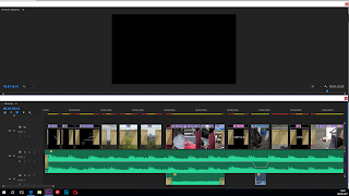
  • I started by uploading all my shots onto the computer and then putting them in separate editing folders. I did this first of all because it would make it easy and convenient for me to access shots because I would know where each shot would be. This made it easy for me to access my shots when I needed them.  I had various other folders for music, sound effects, titles and captions. The benefits of organising the editing this way was that it made editing the actual trailer much smoother. This meant spending time compiling the material. Furthermore, I had created a shot list which I already had a running order, so the folders I had created allowed me to follow it. After this, I had to edit my shots, so what I did was that I opened each shot and trimmed them. The multi track feature in the software allowed me to place all my shots onto one layer and all the other elements, like music and sound effects, and titles and captions on separate layers.


  • When I decided on the music I wanted to use from Spotify, I used the Adobe Audition software to cut down the tracks. The digital technology in post production allowed me to be creative and make use of all the software to create a successful teaser trailer.

  • By using Photoshop, it allowed me to successfully create my poster and magazine cover. Photoshop allowed me to be creative and layer each image, altering colour schemes and fonts. I used a range of tools including the eye dropper tool and the cropping tool. 


Here are the stages which I did for my poster cover by using Photoshop:


Here are the stages for my magazine front cover by again using Photoshop: